
Things that annoy me... LetGo sign-in page redesign
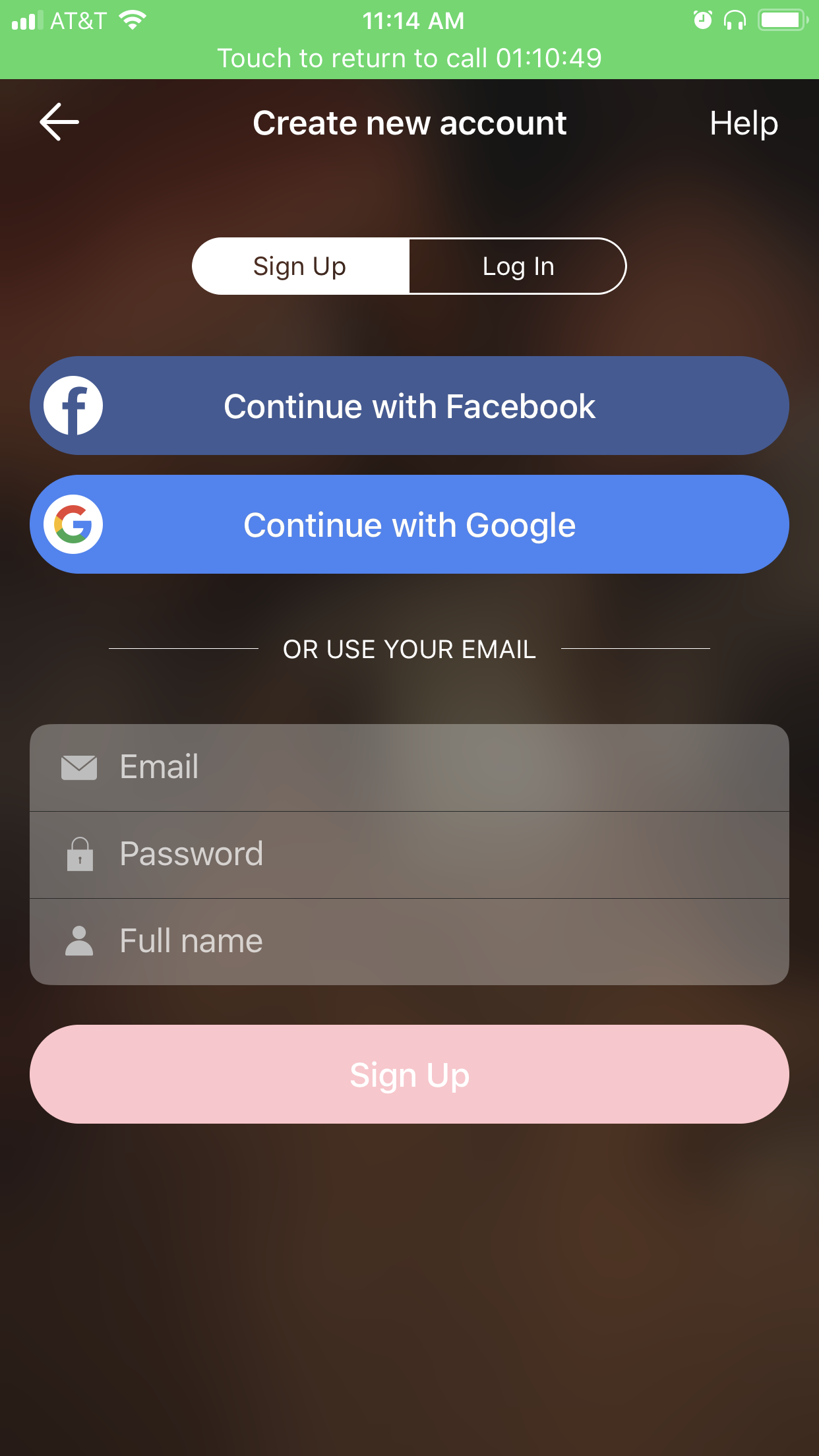
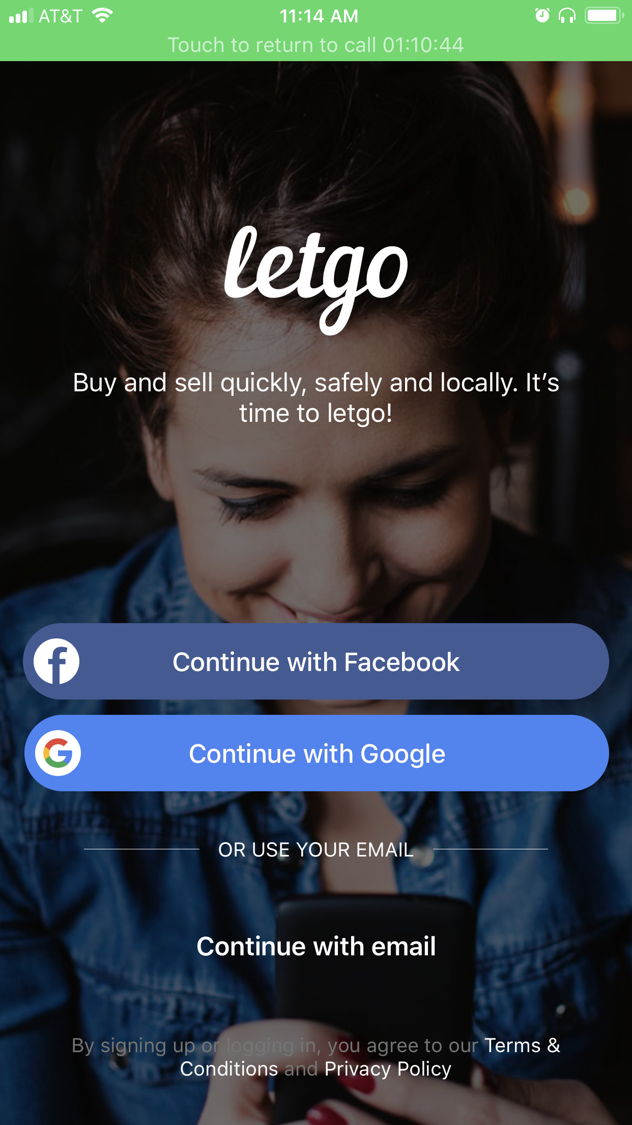
Have you ever downloaded an app, opened it up and then cringed a little? My mom told me about an app my brother was using to buy furniture, LetGo. I needed to sell some furniture, so I decided to give it a try after a failed Craigslist attempt. I didn’t get very far into the app after starting the sign in process. It was one of those first impressions that leaves you wondering how the app gained enough popularity for my mother to know about it. To be fair, this isn’t a horrible app, my main gripe right now is their sign up/in page.
When trying to sign into the app, I was confused about what was a button and which I should press for the results I wanted. It took a lot of assumptions and some unproductive tapping around that wasted time, betrayed my trust and made me frustrated.
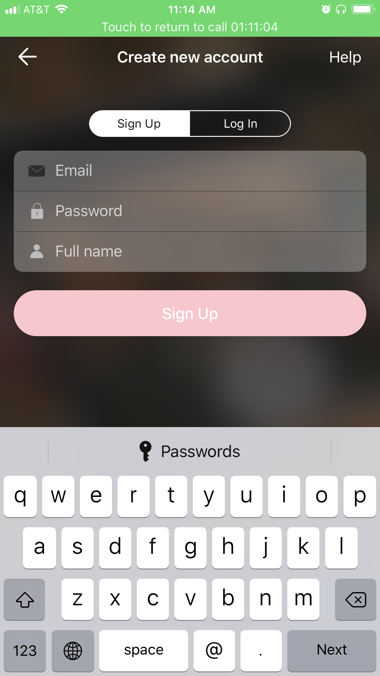
As you can see below they offer multiple options for sign-in, which is great except that once an option is chosen (I chose to use email), those other options do not disappear, but remain to clutter and confuse the following screens while offering even more confusing and unnecessary language. Do I tap the top “Sign In” or the bottom “Sign In”…both??

Of course I immediately took screen shots and said, there is a very easy fix to this, I will draw it!
First I drew wire frames of the original screens.

Not great, but you get the gist here…
A really great thing about wire frame drawing is removing the pictures and weird colors! That really snazzy stock photo of the pretty woman was distracting me from from the bad design. With that out of the way, my goals became clearer. I knew I wanted to un-clutter the screen, but I wanted to see what other apps were doing on their sign in pages as well. Maybe what LetGo was doing is standard practice.
Of course I was right. Other apps clear out the other options when one is chosen:
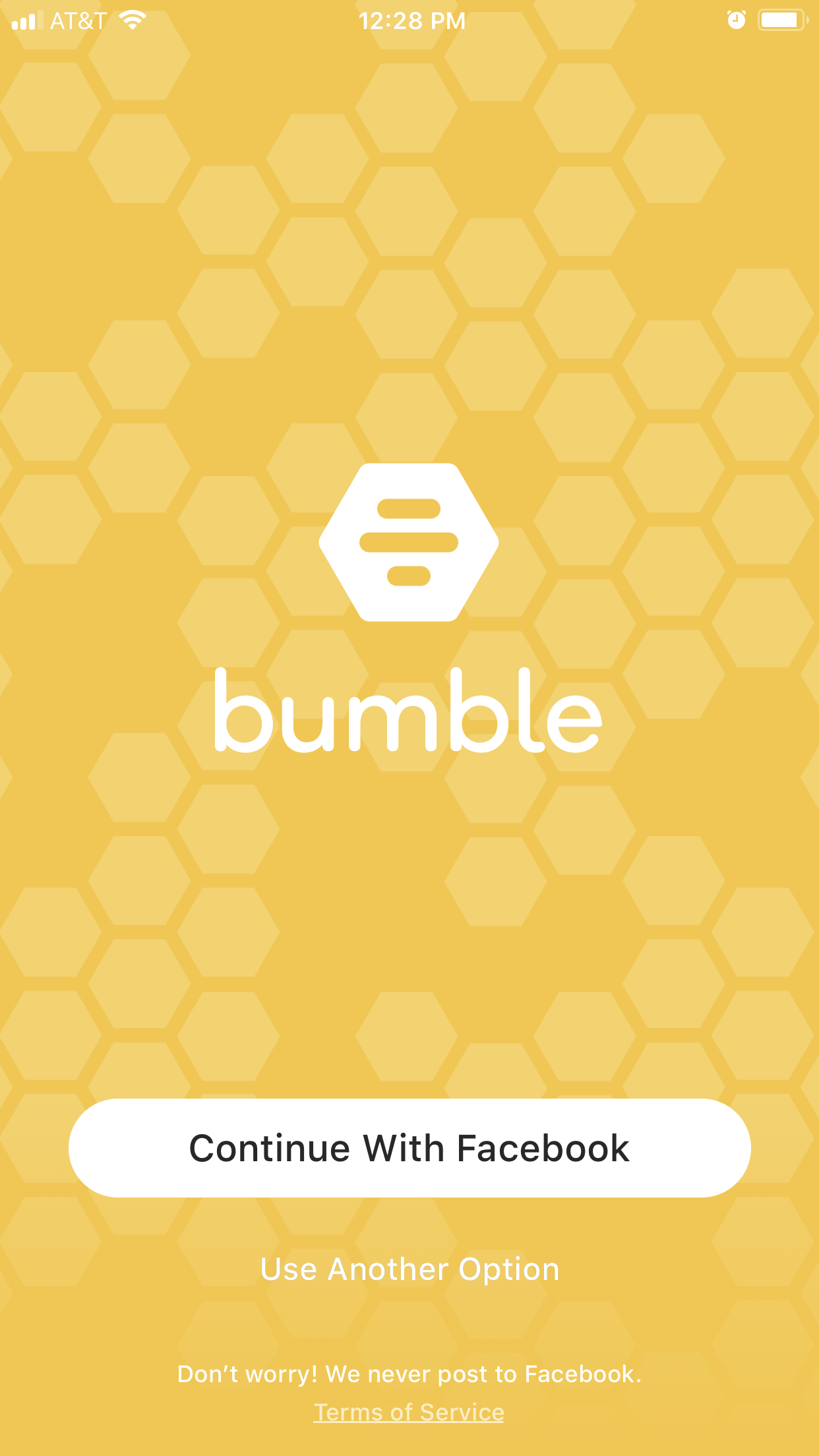
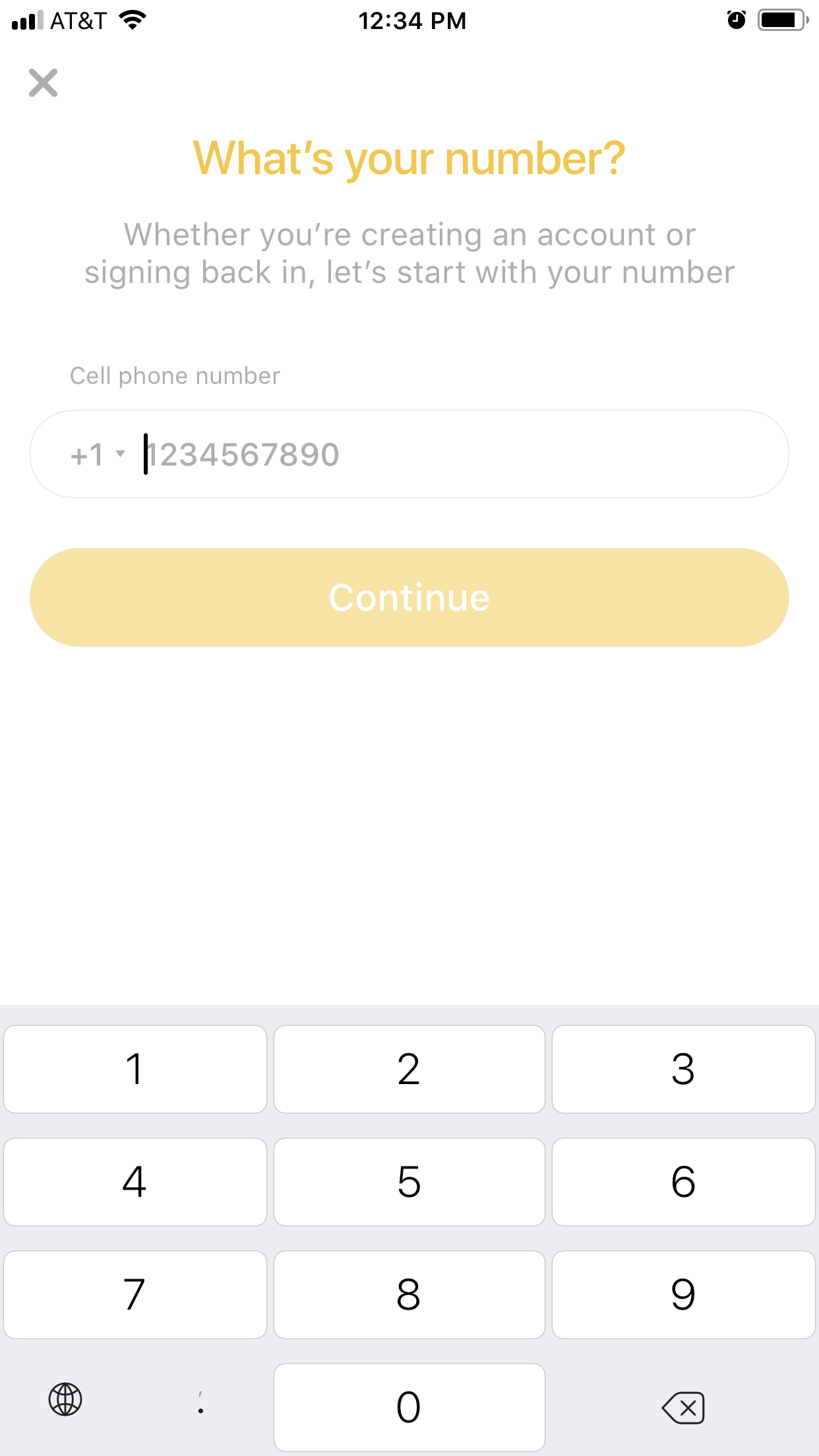
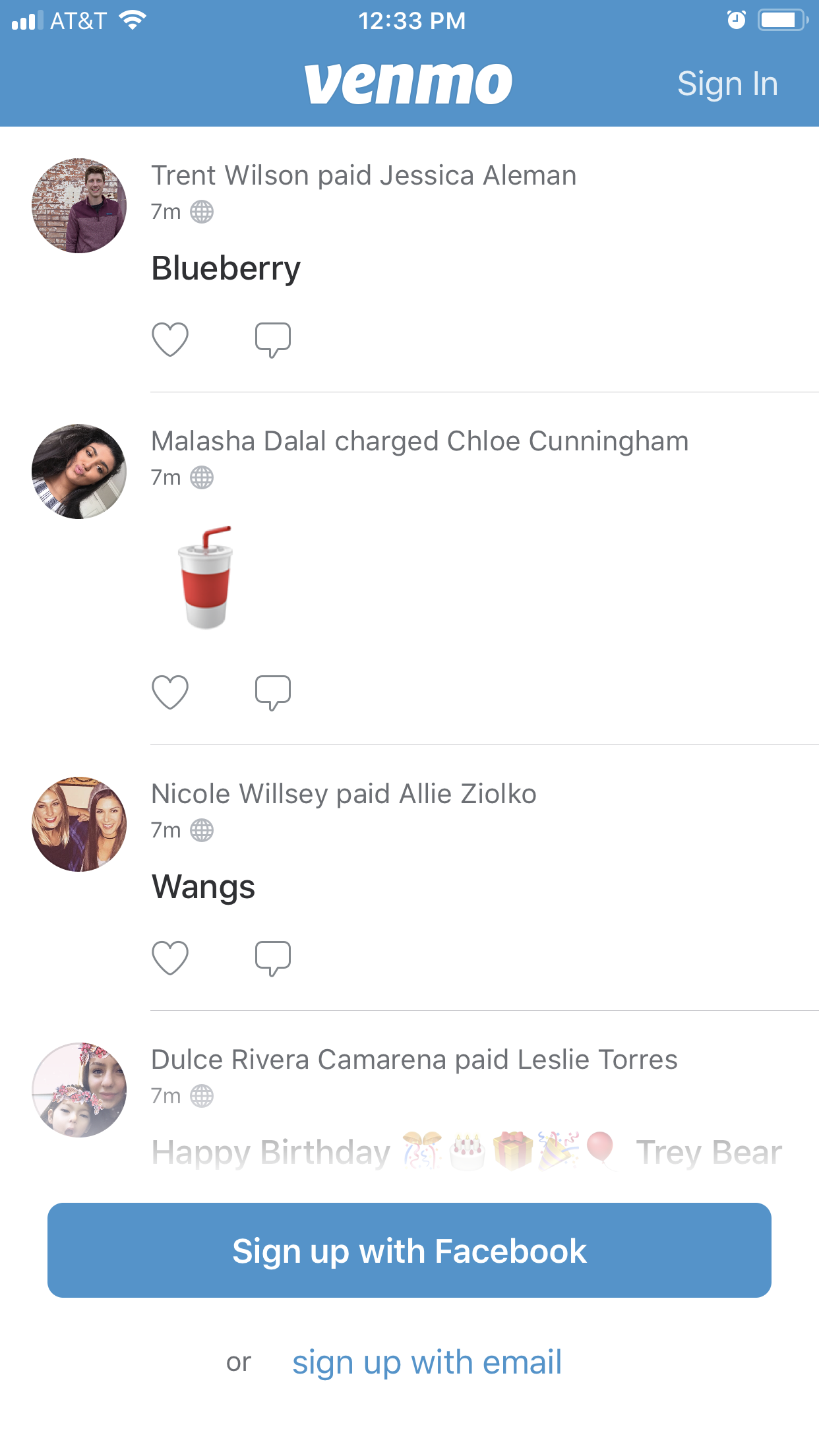
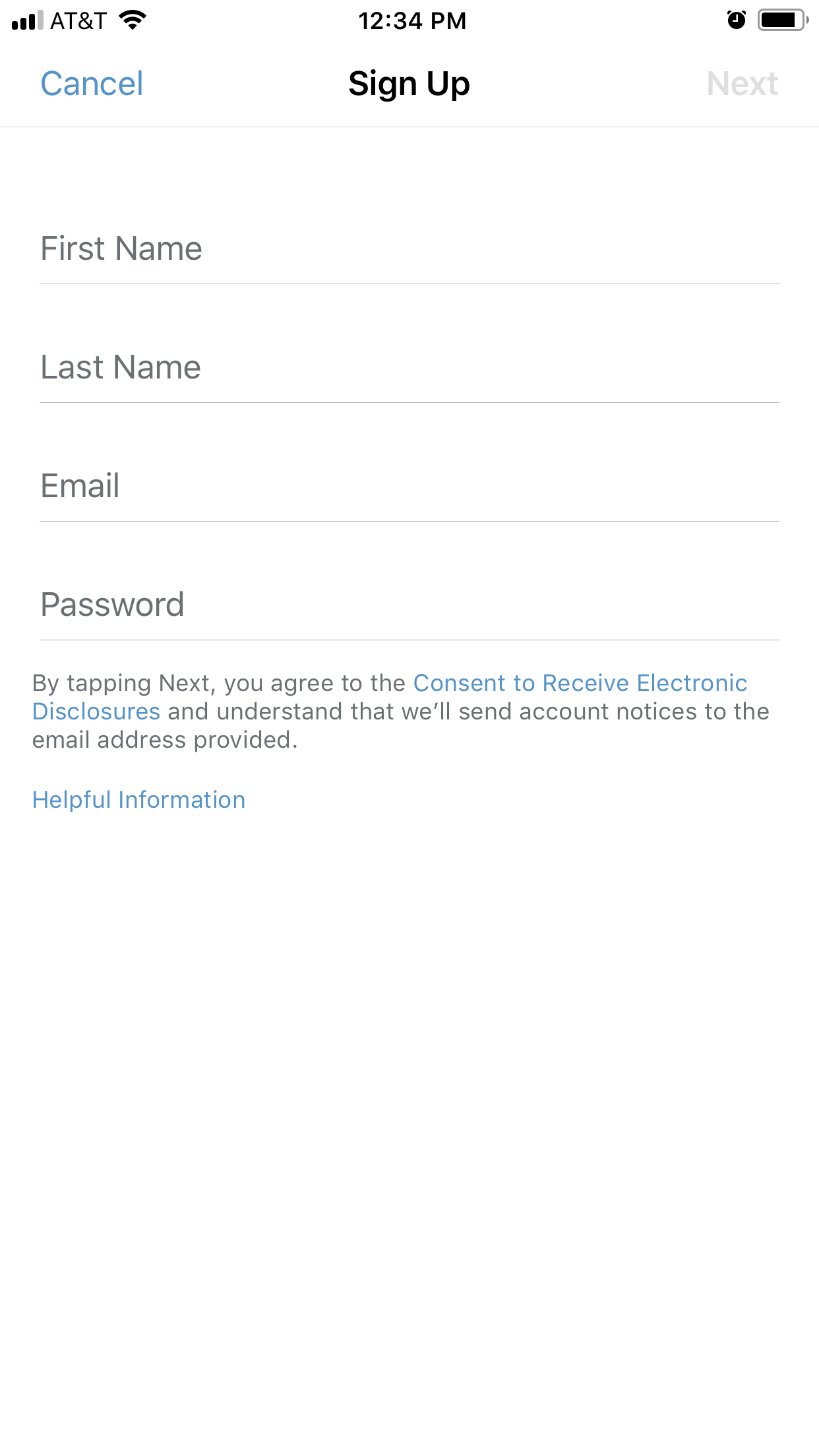
The two images on the left are from Bumble and the two images on the right are from Venmo. Both apps offer multiple ways of signing in and then only ask for information pertinent to the option chosen (sign in with other or email both times).
When I drew wire frames for my suggested changes, I knew I wanted the second screen layout to account for the native keyboard that would pop up to type in necessary information. The original LetGo sign up screens shifted their layout when the keyboard popped up. I thought that was unnecessary.
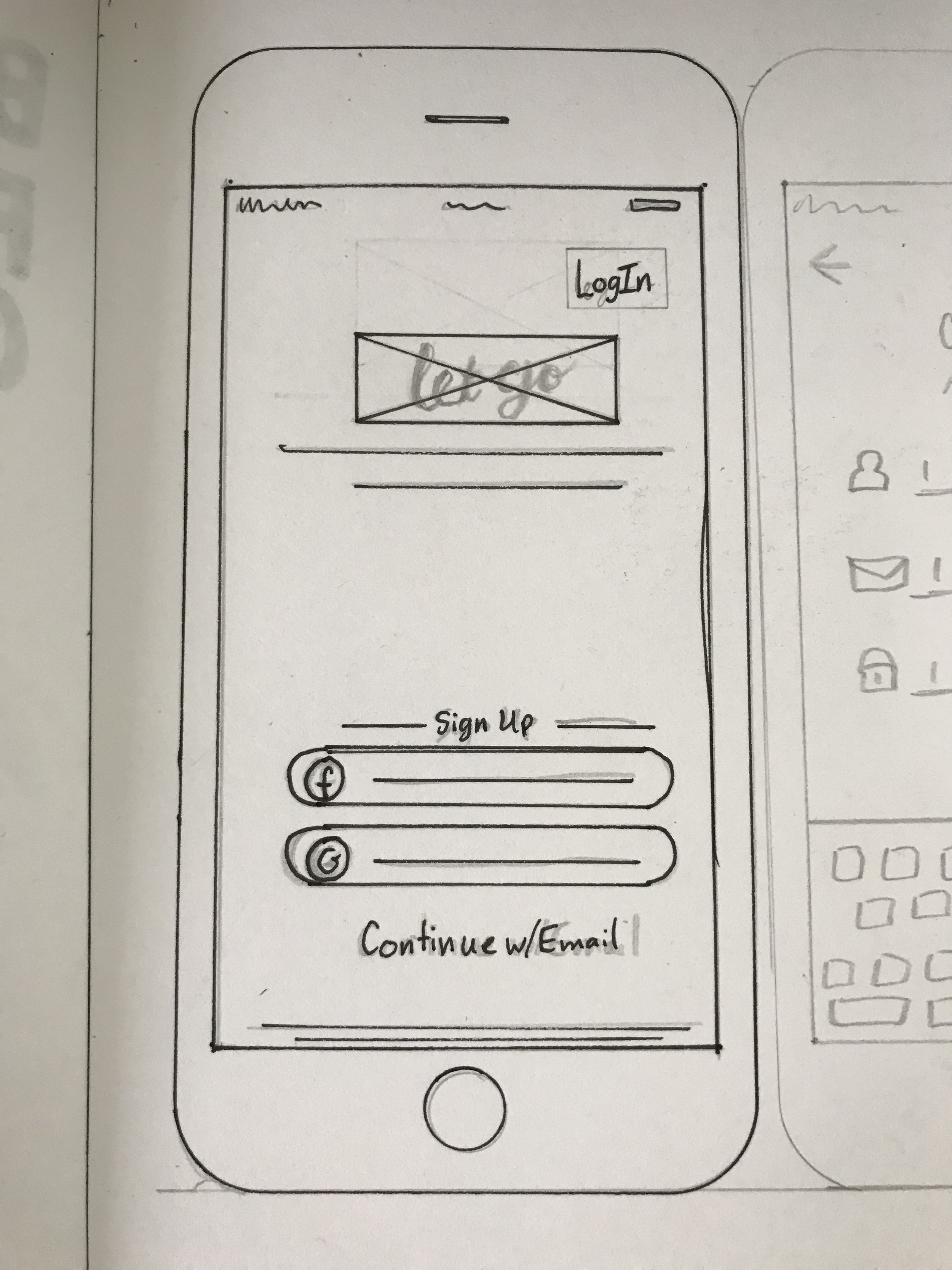

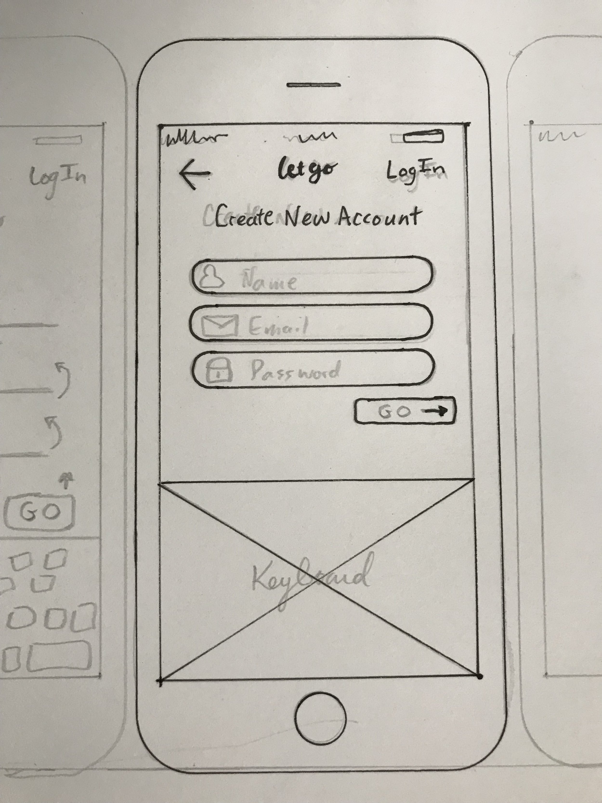
On the home screen I added a “Log In'“ button to the top in case users already had an account. I cleaned up the language so there was only one line of text prompting a sign in by email.
On the second screen I first removed the pill bar at the top that neither clearly tells you whether you are signing up or logging in. I cleared out the options to sign up using Facebook and Google. If a user did change their mind, they could use the back arrow to return to the main page and choose another option without confusion. Without the extra buttons on the screen, there is space for the keyboard to appear at the bottom without having to make a whole new screen that adjusts to the addition of the keyboard. I would also suggest making the action button (sign up/go) look more like an action button, that something progressive will happen when it is tapped.
Finally I suggest they invest in some illustrations for their sign-in page or just leave the background blank and to also choose a darker color for the sign-up button. The stock photo of the pretty woman really has nothing to do with the service they provide. At the moment, the pale pink of the sign-in button does not highlight the words “Sign-up” and on low res screens, might not be seen at all for the lack of contrast.